Beta 2024.11.5 - Level Rebalance and Magenta Canyon!
So long, impossible level 2...
After hearing the cries of nearly all playtesters about the insane difficulty of the first level, I decided to do something about it. I changed the design process for the waves.
Instead of blindly trying random configurations of ships, intervals, etc. I added some utilities to help me visualize the amount of health per second (HPS) each wave distributes, in a very poor estimate. On the side, I added some debug tools to visualize the current cannon damage per second (DPS). Now, I have a much more accurate representation of how hard the wave will be from the editor window, and then I just need to make sure that the next wave is only about as hard (or harder... hehehe) as the player should be able to handle, considering the amount of cash the player collected the previous wave.
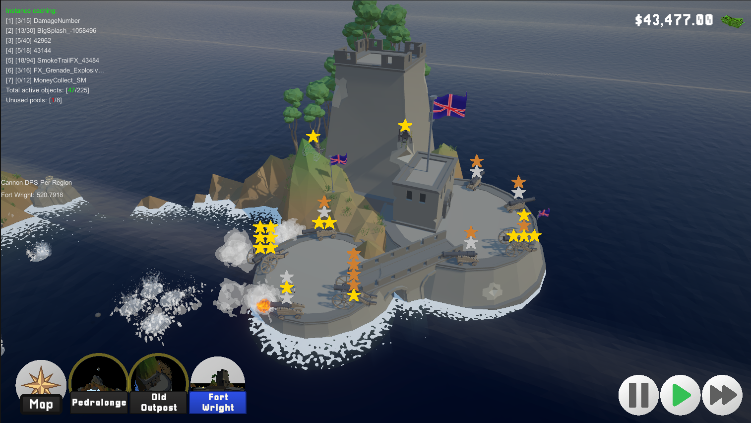
Of course, the tides always change. Sometimes you get fat, rich pirates who spent all their money on food and forgot to put armor on their ship. Take those opportunities to upgrade cannons. Which, by the way, have new insignia to denominate their levels!
Now. The level balance was improved on level 2, the archipelago fortress of Fort Wright, as well as the secret level 3 which was nearly impossible to reach (thank God, it was completely unfinished), is now more reachable than ever, and is also playable, and even almost fun? It's still, let's say, a quarter finished. But it's a good taste of what's to come.
Showing the cannon power level, and getting rid of the Manage button
It's time to let go of the Manage button. It took too much visual space, and in some camera angles made it impossible to interact with anything. So now we highlight the cannon with a shader and selection works as normal, you just need to click on the cannon directly. But, more interestingly, why did I want to free up this space?
To show the cannon level, of course! But how?
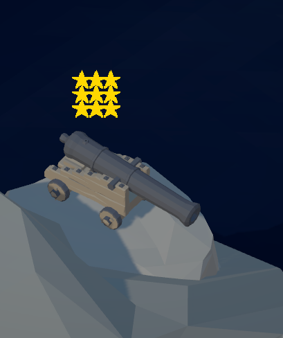
I initially decided on a simple text "Lv1" or whatever. But this felt too uninspired. So I wanted to come up with a cool visual treat for the user to quickly gather how powerful their cannon is at a glance. Then see the actual numbers by clicking on it. But the point is less to know precisely what you need to upgrade, but to visualize a "power level" and help you prioritize what cannons to upgrade.
Let's take a look at what a cannon looks like when it's placed on the map:
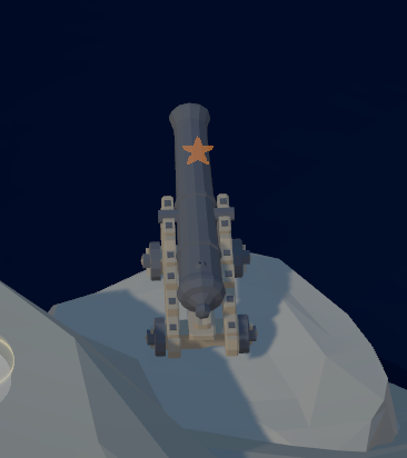
Here's what it looks like when you upgrade any status once:
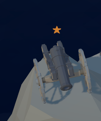
And if you upgrade all of the standard cannon's statuses once:
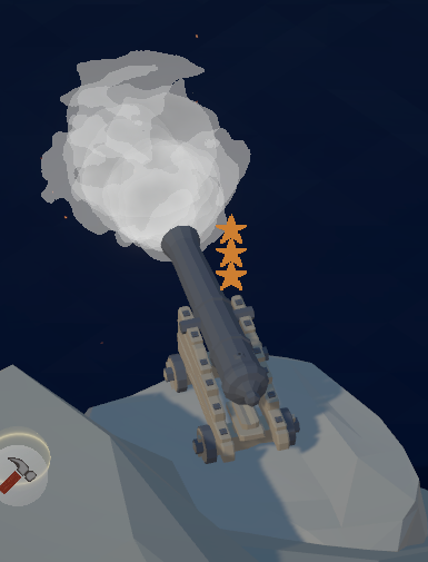
But as the ships get closer, it's important to upgrade the damage. Here's what it looks like at max damage:
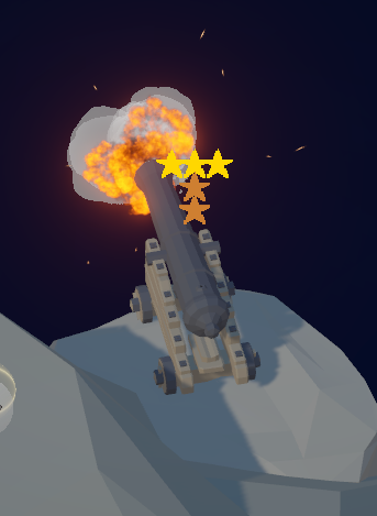
But if you just decided to burn all your money on a single cannon? Well, you could try, but I'll spoil it for you, to save you the expenses:
If you played our game, leave us an annonymous feedback.
Thank you!
Files
Get Recolonizer – Tower Defense
Recolonizer – Tower Defense
Defend your island from invaders in this fast-paced tower defense
| Status | In development |
| Author | forloopcowboy |
| Genre | Strategy |
| Tags | Alternate History, Automation, Family Friendly, Indie, Low-poly, Pirates, Tower Defense |
| Languages | English |
More posts
- Beta 2.9 Pre-Release: Freeing the cameraApr 06, 2025
- Beta 2.9 Pre-Release: Reducing the punishmentMar 26, 2025
- Beta 2.9 Pre-Release: Introducing the booty looter (no joke)Mar 23, 2025
- Beta 2.9 Pre-Release: Introducing speedrunningMar 16, 2025
- Beta 2.9 Pre-Release: A new HOT tower is coming...Mar 15, 2025
- Beta 2.9 Pre-Release: A big refactor and a proper soundtrack!Mar 13, 2025
- Beta 2.8 - New projectile, day-night cycles, game settings menu.Mar 06, 2025
- Future plans: Story mode, progression system, official release!Mar 04, 2025
- Beta 2.7 - Graphical updates, version migration, and some great news!Mar 03, 2025
- Beta 2025.02.3 – Introducing the gatling gun, and rebalancing unlocks...Feb 26, 2025

Leave a comment
Log in with itch.io to leave a comment.